

Color Psychology in Residential Interiors: What Designers Recommend
Introduction
Color is more than just a design choice—it’s a powerful psychological tool that can influence how we feel, think, and behave. In residential interiors, color plays a critical role in shaping the ambiance of a space. From warm, inviting tones in the living room to cool, calming shades in the bedroom, color psychology guides many of the decisions professional interior designers make.
This article explores how color psychology affects residential interiors and what expert designers recommend when choosing a palette for each room.
Understanding Color Psychology
Color psychology studies how different hues affect human emotions and behavior. While responses to color can be subjective, there are some commonly accepted psychological associations:
- Red: Stimulates energy, passion, and appetite. Often used in dining areas.
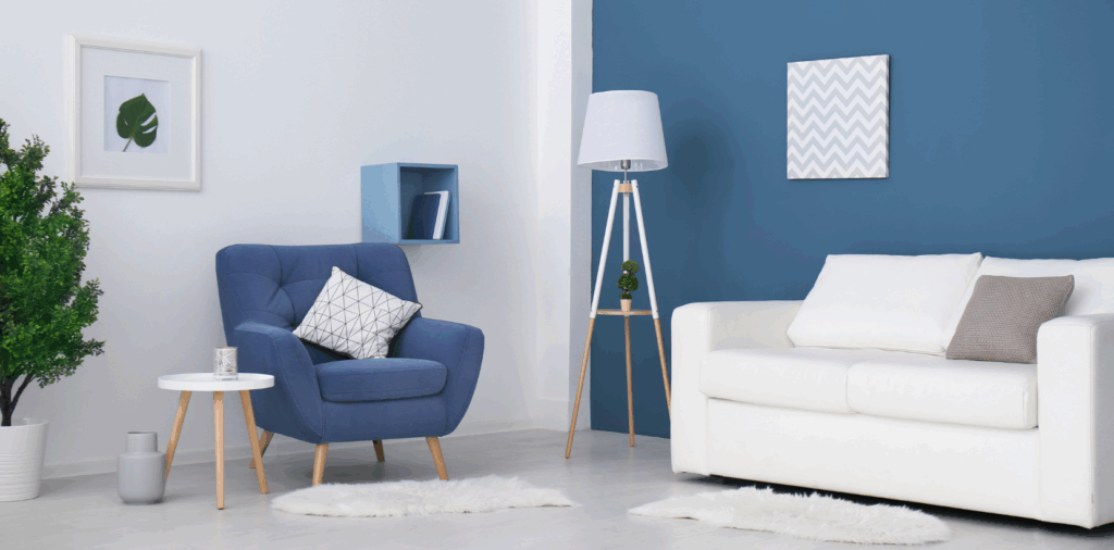
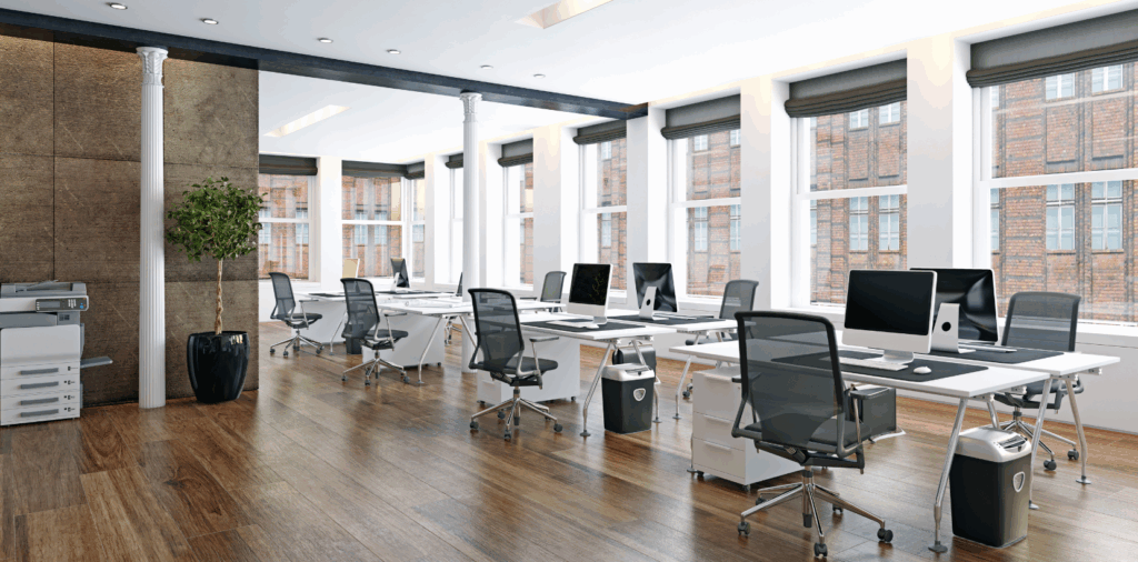
- Blue: Encourages calmness, serenity, and focus. Ideal for bedrooms and offices.
- Green: Represents nature, balance, and renewal. Suitable for almost any space.
- Yellow: Evokes happiness, optimism, and creativity. Great for kitchens and playrooms.
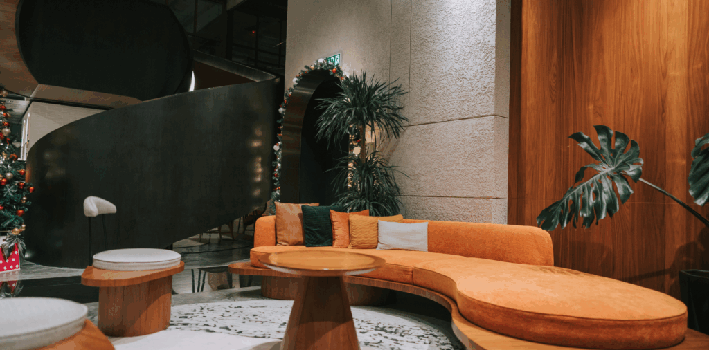
- Orange: A lively, energetic hue associated with enthusiasm and warmth.
- Purple: Often linked with luxury, creativity, and spirituality.
- Neutrals (white, beige, gray): Offer flexibility and a calming backdrop.
Room-by-Room Color Recommendations
1. Living Room
The living room is a hub for family gatherings and social interaction, so it should feel welcoming and cozy.
Designer Tip: Choose warm tones such as soft beige, creamy white, or warm greys to create a comfortable ambiance. For a bold look, accent walls in terracotta or navy can add sophistication.
- Recommended Colors: Taupe, light gray, dusty pink, soft peach, navy.
- Avoid: Bright red or neon tones, which can feel too stimulating for relaxation.
2. Kitchen and Dining Area
The kitchen is often referred to as the heart of the home. It’s where families bond and guests gather.
Designer Tip: Use cheerful colors that stimulate appetite and communication. Yellows and soft oranges can enhance energy, while white or light gray keeps the space feeling clean and fresh.
- Recommended Colors: Mustard yellow, sage green, warm white, terracotta.
- Avoid: Dark or overly cool tones that can make the space feel cold or uninviting.
3. Bedroom
The bedroom is a sanctuary for rest and relaxation, so colors that soothe the senses are best.
Designer Tip: Cool colors like soft blues, greens, and muted lavenders help lower stress levels and promote better sleep.
- Recommended Colors: Sky blue, sage green, lavender, warm beige.
- Avoid: Bright colors like red or orange, which can increase heart rate and hinder relaxation.
4. Bathroom
Bathrooms can serve as both functional and spa-like spaces, depending on the color palette.
Designer Tip: Whites, light grays, and seafoam greens are commonly recommended to evoke a clean, crisp environment. For a luxurious feel, jewel tones like deep emerald or navy can be added in moderation.
- Recommended Colors: Soft teal, white, pale gray, dusty rose.
- Avoid: Overly dark hues that can make the space feel cramped.
5. Home Office
With more people working from home, a functional and focused workspace is essential.
Designer Tip: Blue tones are best for concentration, while green supports a feeling of balance and reduces eye strain. Add pops of yellow for creativity if your work involves brainstorming.
- Recommended Colors: Slate blue, forest green, sand, muted yellow.
- Avoid: Overstimulating colors like bright red or overly dull hues that might sap energy.
6. Kids’ Room
Children respond strongly to color. The right palette can aid in their development and mood regulation.
Designer Tip: Use soft pastels for younger children, while older kids may enjoy brighter, energetic shades. Use bright accents rather than painting an entire room in a bold hue.
- Recommended Colors: Light blue, pastel pink, sunshine yellow, mint green.
- Avoid: Very dark or neon colors which can overstimulate or feel overwhelming.
7. Entryway or Hallway
The entryway sets the tone for the home and makes the first impression.
Designer Tip: Choose inviting tones like warm neutrals or soft greens to create a welcoming vibe. Reflective finishes can enhance natural light and make the space feel more open.
- Recommended Colors: Soft beige, sage, blush, pale gray.
- Avoid: Harsh whites or very dark tones that may feel unwelcoming.
Color Combinations Designers Love
Interior designers often rely on color theory and the color wheel to create harmonious combinations. Here are a few popular strategies:
- Monochromatic: Variations of one color (e.g., light blue, navy, sky).
- Analogous: Colors that sit next to each other on the wheel (e.g., yellow, orange, red).
- Complementary: Opposite colors on the wheel (e.g., blue and orange) for contrast.
Designer Tip: Stick to the 60-30-10 rule—60% dominant color, 30% secondary color, and 10% accent color—to keep interiors balanced.
The Role of Lighting in Color Perception
Lighting can dramatically affect how colors look in your home. Natural light brings out true colors, while artificial lighting can alter them.
- North-facing rooms: Cooler light, best suited for warm colors.
- South-facing rooms: Lots of warm light, allowing for cooler tones.
- East-facing rooms: Bright mornings, ideal for yellows and warm neutrals.
- West-facing rooms: Warm evenings, benefit from cool hues to balance the glow.
Designer Insight: Always test paint swatches on the walls at different times of day before finalizing your selection.
Cultural and Personal Influences
Color preferences can also be shaped by culture, personal experiences, and lifestyle. In Indian homes, for example, vibrant colors like maroon, gold, and turquoise may be used to reflect cultural heritage, while Scandinavian design often leans into whites and soft neutrals for a minimalist feel.
Designer Tip: Personal connection to color should always take precedence. If a certain shade brings you joy or comfort, it’s the right choice for your home—even if it breaks the traditional rules.
Conclusion
Color psychology is an essential consideration in residential interior design. It not only shapes the visual aesthetics of a space but also profoundly impacts the mood and well-being of its occupants. Interior designers recommend choosing colors based on the function of the room, the lighting, and the emotional tone you wish to set.
Whether you’re seeking serenity in your bedroom, vibrancy in your kitchen, or focus in your home office, the right color palette can transform your living environment. By understanding the psychological effects of color and applying designer-recommended strategies, you can create a home that is both beautiful and emotionally supportive.
Book an appointment with Opulent Interior Spaces to transform your home into a haven of luxury and style.
Read Our Latest Blogs
-
 Color Psychology in Residential Interiors: What Designers Recommend
 -
 Exploring Minimalist Luxury in Thane's Interior Design
 -
 How to Design a Vastu-Compliant Modern Office in Thane
 -
 How to Choose the Best Interior Design Services for Your Home
 -
 Runwal Group Luxury Apartments: The Best Interior Design Styles for High-End Homes